
Navigating the world of fashion color and style matching can transform your wardrobe from a collection of items into a powerful tool for self-expression. More than just following trends, understanding the semantic relationships between color, cut, and context allows you to create outfits that feel intentional, harmonious, and authentically you.
Part 1: The Foundation – Color Theory in Fashion
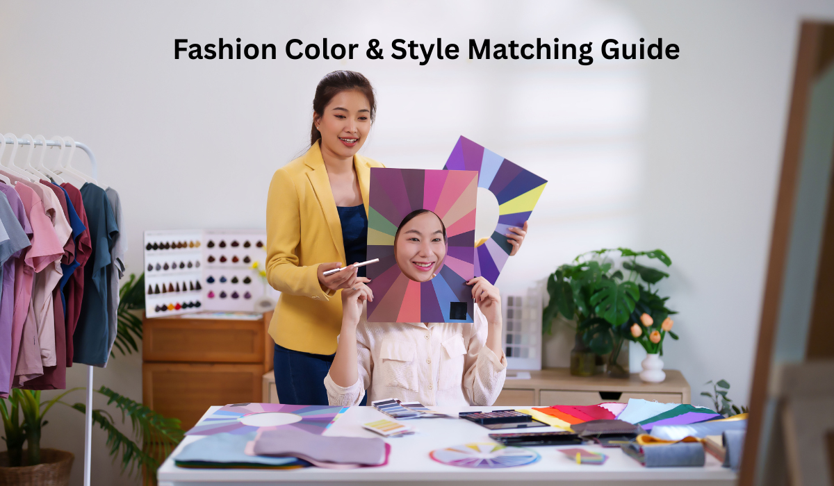
Color is the first thing the eye registers in an outfit. Mastering its logic is the first step to intentional dressing.
The Fashion Color Wheel: Your primary tool. It illustrates the relationships between hues.
- Primary Colors: Red, blue, yellow. The building blocks.
- Secondary Colors: Green, orange, purple. Created by mixing primaries.
- Tertiary Colors: Vermilion, teal, magenta. Mixes of primary and secondary.
Core Color Schemes for Outfit Coordination:
- Monochromatic: The art of using varying tints, tones, and shades of a single color. This scheme is effortlessly sophisticated and elongates the silhouette. Think: a cream sweater, taupe trousers, and chocolate brown loafers.
- Analogous: Combining colors that sit next to each other on the wheel (e.g., blue, blue-green, and green). This creates serene, comfortable-to-the-eye outfits that are rich yet low-contrast.
- Complementary: Pairing colors directly opposite each other on the wheel (e.g., red and green, blue and orange). This creates maximum contrast and vibrancy. For a wearable approach, use one color as the dominant hue and its complement as an accent (e.g., a navy suit with a rust-colored pocket square).
- Triadic: Using three colors equally spaced around the wheel (e.g., the primary trio: red, blue, yellow). This is bold and requires balance. Let one color dominate and use the other two for accents.
- Neutrals as Anchors: Black, white, grey, navy, beige, and denim chambray form the backbone of a wardrobe. They ground brighter colors, act as buffers between clashing hues, and allow statement pieces to shine.
Part 2: The Personal Dimension – Style Analysis and Customization
Theory meets the individual. This is where you tailor principles to your unique attributes and preferences.
Seasonal Color Analysis: A system to identify the palette most harmonious with your natural coloring (skin tone, eye color, hair color).
- Spring/Warm & Light: Clear, warm colors like coral, peach, lime green, and soft aqua.
- Summer/Cool & Light: Cool, muted colors like lavender, dusty rose, sage, and soft grey.
- Autumn/Warm & Deep: Earthy, rich colors like mustard, olive green, terracotta, and burnt orange.
- Winter/Cool & Deep: Vivid, cool colors like true red, emerald green, royal blue, and stark black and white.
(Note: This is a simplified overview; professional analysis is more nuanced.)
Understanding Style Aesthetics: Your personal style vibe dictates how you apply color. A neon color block suit fits an edgy, modern aesthetic, while the same bright pink might be used as a floral accent in a cottagecore or romantic style.
The Role of Context (Occasion & Vibe):
- Professional Wear: Often leverages monochromatic or analogous schemes with neutral bases. Color is used strategically for authority (navy, grey) or approachability (softer blues, greens).
- Casual & Weekend: Allows for more experimentation with complementary accents and playful print mixing.
- Evening Wear: Embraces drama through rich jewel tones, metallic accents, and high-contrast pairings.
Part 3: Practical Application – Building Cohesive Outfits
How to execute these concepts daily.
- Start with a Base: Choose a core piece (e.g., wide-leg pants, a dress). Identify its dominant color.
- Apply a Color Scheme: Decide on the effect. For elegance, go monochromatic. For interest, add an analogous blouse. For pop, choose a complementary accessory.
- Mind the 60-30-10 Rule: A classic decorating principle that works for outfits.
- 60%: Your dominant color (e.g., trousers + top in similar tones).
- 30%: Your secondary color (e.g., a blazer or cardigan).
- 10%: Your accent color (e.g., a scarf, bag, shoes, or jewelry).
- Accessorize with Intent: Accessories are your tuning forks for color. A burgundy belt can tie a maroon skirt to a pinkish scarf. Match metals to the undertone of your outfit—cool colors (blues, greys) with silver, warm colors (reds, browns) with gold.
- Master Print Mixing: The unifying tool is color. Choose prints that share at least one common color. Pair a striped top with a floral skirt if both contain the same shade of blue.
Part 4: Tools & Mindset for Success
- Create a Personal Color Palette: Identify -5 core neutrals and 5-7 signature colors from your seasonal analysis or personal preference. Shop within this palette for maximum mixability.
- Embrace the “Color Feeling”: Understand color psychology. Need confidence? Try red. Want to project calm? Opt for blue. This is the essence of “dopamine dressing.”
- Break Rules Consciously: Once you understand the principles, break them with purpose. Clash colors intentionally for artistic effect. The goal is not rigid adherence, but informed choice.
Final Styling Verdict
A Fashion Color & Style Matching Guide is less about rigid rules and more about developing a fluent vocabulary in the language of personal presentation. By decoding color theory, investing in personal style analysis, and applying practical outfit coordination principles, you empower yourself to dress with clarity and confidence. The ultimate goal is harmonious dressing where every element—from hue to silhouette—works in concert to express who you are and how you wish to be perceived. Start with one principle, experiment fearlessly, and let color become your most powerful sartorial tool.